
Show Your Stripes
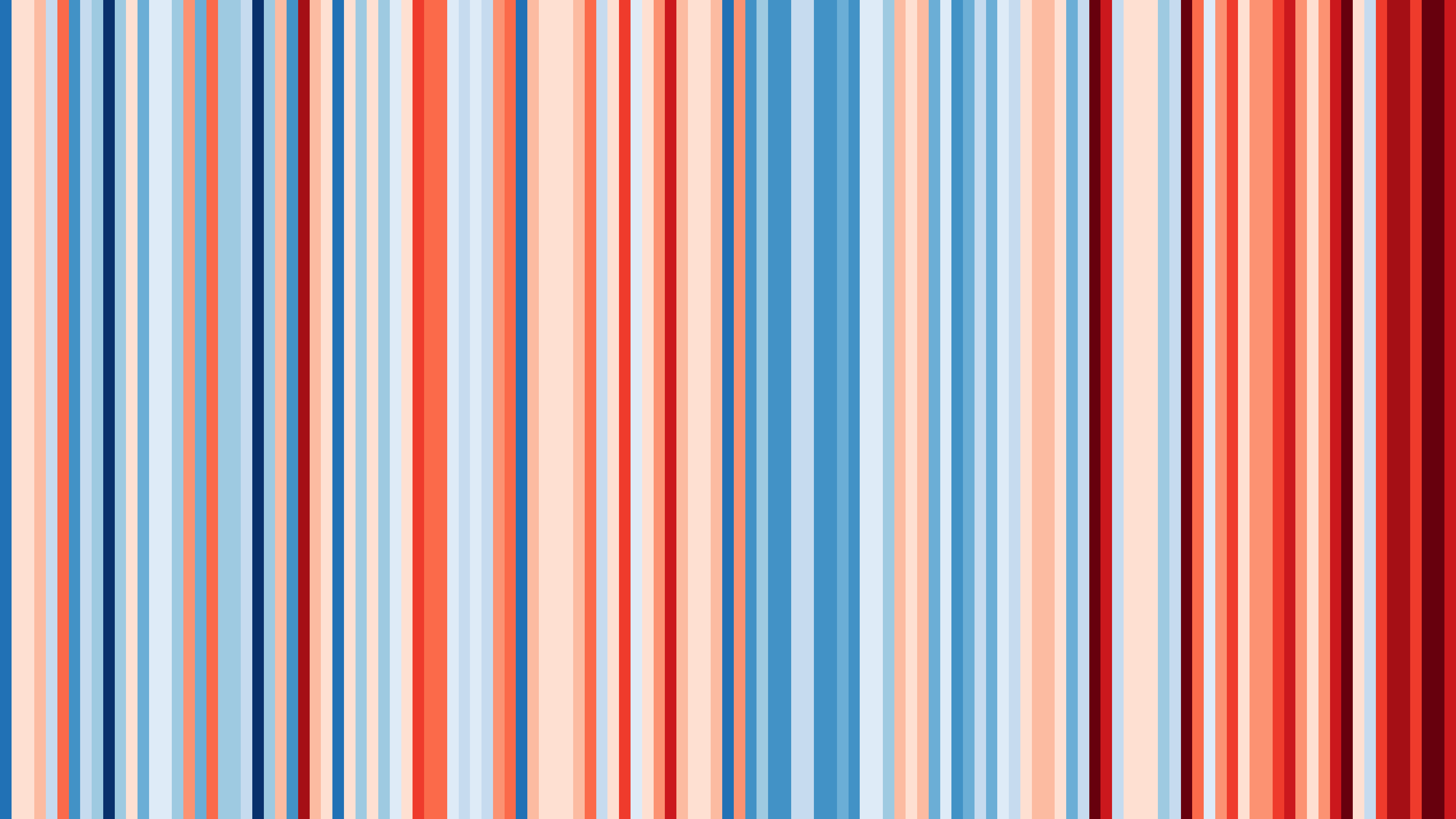
This first image is of Virginia from 1895-2021.
My home state, where I was born and raised. It's quite a lovely image, a mix of dark blues to dark reds, with moments of light salmon pink and glacier blue. But, what does it mean? This is Virginia's "warming stripes."
"Warming stripes" were created by British climate scientist Ed Hawkins to provide a visual representation of temperature changes over time.
Each stripe signifies another year. Colder years are represented by blues and warmer years by pinks and reds. This next image is of the entire world from 1850-2021.
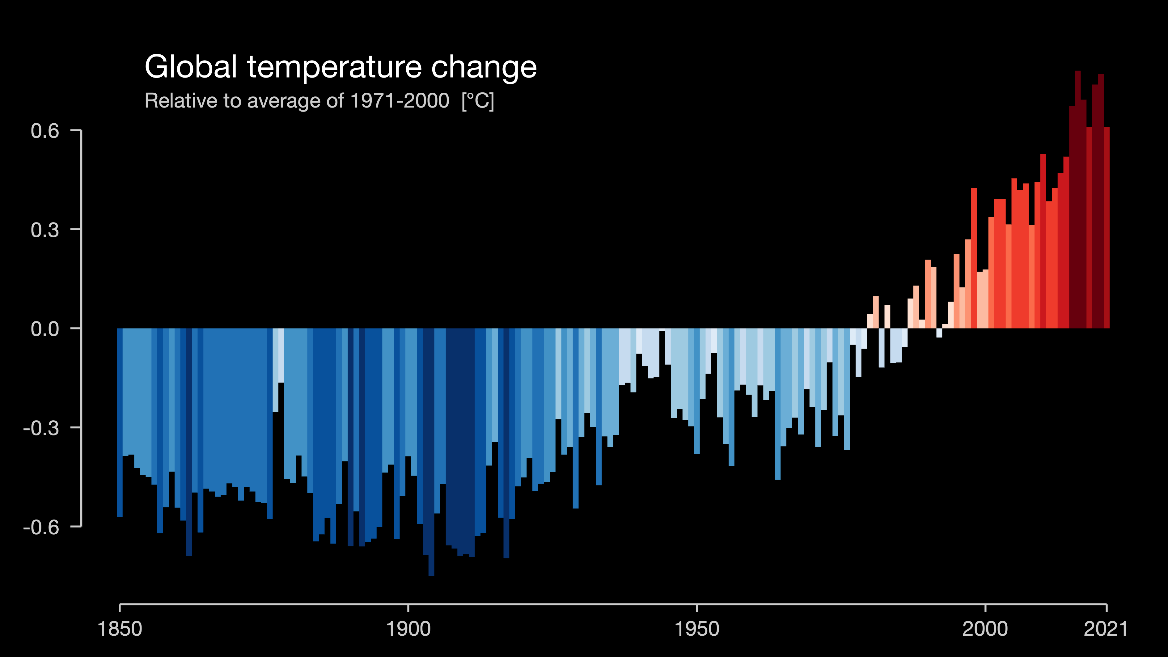
It's amazing to me to see how dramatically temperatures have warmed over the past several years, primarily as a result of human influence.
So, what can we do with this information?
I'd encourage you to look up the warming stripes for your home. What do the warming stripes of your home look like?
Share the image with friends and family as a way to start conversation. Ask older relatives and friends to share their personal experience on how the climate and weather has changed for them over their lifetimes.
Take action! Incorporate daily practices into your routine to help reduce your carbon footprint and vote with your dollars and ballots.
As evident by these images, together, we can make a huge influence on this world.
What color paint will we use for our future stripes? The pigments and brushes are in our hands.
for the love of the world + all on it.
x o, rachel
Sources: showyourstripes.info